Sunday, July 30, 2006
Super Suggestive
I know that most of the time I'm probably reading things into old Silver Age comics that weren't intended, but I'm having trouble believing that the artist wasn't trying to suggest something else here:
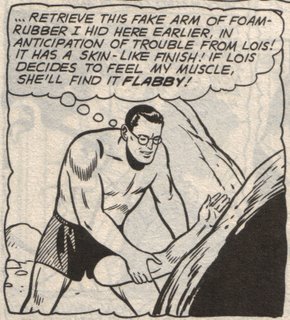
"If Lois decides to feel my muscle, she'll find it flabby." I mean, come on.
I know that most of the time I'm probably reading things into old Silver Age comics that weren't intended, but I'm having trouble believing that the artist wasn't trying to suggest something else here:

"If Lois decides to feel my muscle, she'll find it flabby." I mean, come on.
Sunday, July 16, 2006
I'm Only Human, Damn It
I'm trying to cut back on the number of comics I buy. Really, I am. I've given up pre-ordering through online comic shops because I tend to buy comics I'm not really interested in simply because the discount is so generous. And I have so many books I've already bought that sit unread on my bookshelves, not to mention all the graphic novels available for free from my local library.
But there's no way in hell I could resist this:
 Thanks to David, Johanna, and Chris for providing the sustained coverage of this title that finally wore me down and convinced me I couldn't live without it for one second longer.
And although I have mixed feelings about buying yet another comic (especially one I didn't even know existed before the week began), I am excited to be getting in on the ground floor for what is sure to become the next critical darling of the comics blogosphere.
I'm trying to cut back on the number of comics I buy. Really, I am. I've given up pre-ordering through online comic shops because I tend to buy comics I'm not really interested in simply because the discount is so generous. And I have so many books I've already bought that sit unread on my bookshelves, not to mention all the graphic novels available for free from my local library.
But there's no way in hell I could resist this:
 Thanks to David, Johanna, and Chris for providing the sustained coverage of this title that finally wore me down and convinced me I couldn't live without it for one second longer.
And although I have mixed feelings about buying yet another comic (especially one I didn't even know existed before the week began), I am excited to be getting in on the ground floor for what is sure to become the next critical darling of the comics blogosphere.
Saturday, July 15, 2006
Scott Free
I attended Scott McCloud's free lecture at MCAD last night. (Thanks to Tom for pointing this out.) It was an interesting, entertaining presentation (for the most part; audience interest, including my own, started to wane in the third portion of McCloud's talk when he seemed to forget about the audience momentarily (generally he was very good about engaging the audience with quick, funny jokes) and started talking with himself about webcomics). If McCloud ever gets tired of lecturing on comic art theory, he could probably make a killing in the corporate world teaching people how to liven up their public speaking: McCloud's PowerPoint presentation was one of the best I've seen, with lots of great visual examples reinforcing his points rather than simply repeating them word for word.
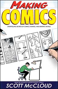 I arrived a little late, so I missed some of his opening section discussing his new book, Making Comics. To be honest, I didn't really have much interest in this book before attending this presentation, probably because the title brought to mind all those horrible-looking "How To Draw Manga" tutorials you see at Barnes & Noble. McCloud actually referenced these types of books, saying that in a way they inspired him to create Making Comics. McCloud hopes to fill in the gaps these other books leave by talking about things like "choosing the moment" (which scenes to depict and which to leave off-panel) and "choosing the words" (thinking about the different ways in which words and images can interact on the page). As a self-described formalist, McCloud is very interested in the theoretical language underpinning sequential art (comics), and it sounds like a lot of that will make it into the book. After seeing some of the examples from the book, I'm now highly anticipating it.
Other high points I remember (I'd hoped to take notes but the auditorium was too dark, so these may be somewhat distorted by my poor memory):
McCloud asserted that Western comics (especially superhero comics) reveal the influence of film through their reliance on pin-ups and close-ups (either figures in a tight frame with each other or close-ups of characters looking out directly at the reader), whereas European comics are more interested in naturalistic scenes (scenes showing the action as it unfolds with fewer "cuts" to focus on close-ups) and Japanese comics* are more adept at reflecting characters' inner states (pages where the focus is entirely on the character with distinctive visual cues to depict her emotional state). McCloud showed several examples from various comics that seemed to support these generalizations, but all I could think about was trying to find counter-examples. (I think it might be more useful to talk about the different ways of framing scenes without labeling them by nationality, but then again I have little interest in uncovering who used these techniques first and where they were originally most widespread, unlike McCloud.)
McCloud discussed his theory of "The Four Tribes," or the four broad ways of approaching / doing comics:
McCloud walked the audience through some examples of his favorite webcomics (most of which can be found on his links page). Personally, I'm not very interested in webcomics (mainly because I sit in front of a computer so much the rest of the day I'd prefer to sit down with a print object when I do read comics), but the ones McCloud showcased were great. One of my favorites was PoCom-UK-001, a stunning "hypercomic" that has much better navigation than the traditional browser scrolling (even McCloud admitted: "Scrolling sucks -- let's just get that out there") and a multi-path structure that could provide hours of amusement.
Finally, McCloud revealed that his all-time favorite comic is Jim Woodring's Frank. Not a bad choice.
* I wanted to ask McCloud about Pat O'Neill's opinion that manga aren't comics, but I chickened out, mainly because I couldn't think of a way to express O'Neill's position that didn't sound ridiculous.
I attended Scott McCloud's free lecture at MCAD last night. (Thanks to Tom for pointing this out.) It was an interesting, entertaining presentation (for the most part; audience interest, including my own, started to wane in the third portion of McCloud's talk when he seemed to forget about the audience momentarily (generally he was very good about engaging the audience with quick, funny jokes) and started talking with himself about webcomics). If McCloud ever gets tired of lecturing on comic art theory, he could probably make a killing in the corporate world teaching people how to liven up their public speaking: McCloud's PowerPoint presentation was one of the best I've seen, with lots of great visual examples reinforcing his points rather than simply repeating them word for word.
 I arrived a little late, so I missed some of his opening section discussing his new book, Making Comics. To be honest, I didn't really have much interest in this book before attending this presentation, probably because the title brought to mind all those horrible-looking "How To Draw Manga" tutorials you see at Barnes & Noble. McCloud actually referenced these types of books, saying that in a way they inspired him to create Making Comics. McCloud hopes to fill in the gaps these other books leave by talking about things like "choosing the moment" (which scenes to depict and which to leave off-panel) and "choosing the words" (thinking about the different ways in which words and images can interact on the page). As a self-described formalist, McCloud is very interested in the theoretical language underpinning sequential art (comics), and it sounds like a lot of that will make it into the book. After seeing some of the examples from the book, I'm now highly anticipating it.
Other high points I remember (I'd hoped to take notes but the auditorium was too dark, so these may be somewhat distorted by my poor memory):
McCloud asserted that Western comics (especially superhero comics) reveal the influence of film through their reliance on pin-ups and close-ups (either figures in a tight frame with each other or close-ups of characters looking out directly at the reader), whereas European comics are more interested in naturalistic scenes (scenes showing the action as it unfolds with fewer "cuts" to focus on close-ups) and Japanese comics* are more adept at reflecting characters' inner states (pages where the focus is entirely on the character with distinctive visual cues to depict her emotional state). McCloud showed several examples from various comics that seemed to support these generalizations, but all I could think about was trying to find counter-examples. (I think it might be more useful to talk about the different ways of framing scenes without labeling them by nationality, but then again I have little interest in uncovering who used these techniques first and where they were originally most widespread, unlike McCloud.)
McCloud discussed his theory of "The Four Tribes," or the four broad ways of approaching / doing comics:
- Animist - primarily concerned about getting one's story out with as little distraction as possible from how you're telling the story (prototypical example: Kurt Busiek)
- Classicist - interested in comics as a craft; trying to perfect one's technique in a more representational way (e.g., Hal Foster)
- Iconoclast - interested in "keeping it real" -- using the medium to express truths about life (e.g., R. Crumb)
- Formalist - concerned with exploring the formal properties of the sequential art medium (e.g., Art Spiegelman)
McCloud walked the audience through some examples of his favorite webcomics (most of which can be found on his links page). Personally, I'm not very interested in webcomics (mainly because I sit in front of a computer so much the rest of the day I'd prefer to sit down with a print object when I do read comics), but the ones McCloud showcased were great. One of my favorites was PoCom-UK-001, a stunning "hypercomic" that has much better navigation than the traditional browser scrolling (even McCloud admitted: "Scrolling sucks -- let's just get that out there") and a multi-path structure that could provide hours of amusement.
Finally, McCloud revealed that his all-time favorite comic is Jim Woodring's Frank. Not a bad choice.
* I wanted to ask McCloud about Pat O'Neill's opinion that manga aren't comics, but I chickened out, mainly because I couldn't think of a way to express O'Neill's position that didn't sound ridiculous.
Wednesday, July 12, 2006
Cranky Comic Comments
Back in April I placed a pre-order for a bunch of manga with DCBS. Since I still had a couple bucks to go before I hit the dollar limit for the lowest shipping plateau, I broke down and ordered a couple superhero comics that were being offered at 75% off. Last week, a shipment from DCBS arrived ... with no manga and all the superhero comics I'd ordered. OH CRUEL FATE!!! Oh well, at least I can try to salvage some enjoyment by sharing mypain snark with you, dear reader:
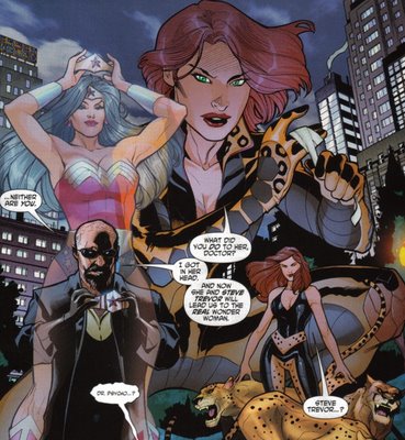
WONDER WOMAN (volume 3?) #1: So does this mean Dr. Psycho is wearing leopard-print boxers? And interesting that Dodson depicts Giganta as the only female character without ginormous breasts. What could it mean???
BRAVE NEW WORLD: Not bad for an 80-page anthology that only cost a buck, but it didn't do anything to convince me to buy any of the series being advertised. Let's run them down one-by-one:
Martian Manhunter: I've always had a soft spot for the character, especially since the early days of the Giffen-era League, but this just looks like heavy-handed gritification of a character I find more interesting when he's the well-adjusted counterpoint to all the other unbalanced personalities around him. The art looked fine, but the scene with J'onn arguing with a cardboard cutout of himself was painfully bad. I don't want to read the adventures of J'onn J'onnz, the Angstiest Alien Alive; I want stories of a grounded Martian Manhunter using his fantastic abilities to help his adoptive siblings.
OMAC: Some nice (if inconsistent) European-looking art can't really cover up this segment's utterly dull plot and incredibly clunky scene transitions. I suppose one could argue that the "it was all a dream" ending explains the awkward panel jumps, but that simply trades one problem for an even larger one: revealing that the events depicted didn't actually occur invalidates the entire story and negates any interest readers may have developed in the characters. We're basically left with two panels of "real" characterization, neither of which does anything to flesh out the main protagonist of the upcoming mini-series.
Really, this installment is such a mess it's almost impressive just how much wrongness Jones manages to cram in in only eleven pages. Here's a bit that at least provides a little unintentional humor: In this scene, Mike Costner is on the run from a pack of OMACs that nearly killed him and a woman claiming to be his girlfriend. But even though his life is in imminent danger, our hero can only think of one thing when the female character lands in his lap:
"Look, I know this isn't the time... (Don't let her know you're staring at her ass! Don't let her know you're staring at her ass!!) ...but you're the first person who's ever tried to protect me..." What a putz.
Uncle Sam and The Freedom Fighters: Whoa! Look at the size of Phantom Lady's ta-tas!! And talk about a great costume design! What a brilliant idea to update Phantom Lady's already suggestive costume with two little glowing arrowheads highlighting her naughty bits!! Hey, fanboys: Here's where to direct your male gaze!! Erik Larsen must be steaming that he didn't come up with this trend-setting design for any of his female characters!
The Creeper: I've always loved the concept of the Creeper, but there haven't been many stories that have done much to make the character genuinely, well, creepy. Andy Helfer and Keith Giffen's retelling of the Creeper's origin in Secret Origins #18 probably came closest in my book, but (as far as I can remember) this revamp was never followed up on. (I seem to remember hearing several times that Giffen had plans for The Creeper, but nothing ever materialized aside from a brief guest appearance in JLI.) I purchased the 90s Creeper series (by Len Kaminski and Shawn Martinbrough) but I honestly can't remember anything about it. (According to Wikipedia, that series tried to tweak the Creeper's origin yet again, suggesting that the involvement of Dr. Yatz was an implanted memory.)
As for the take in this book, it's a bit uneven but it has potential. I actually like the idea of Jack Ryder using his TV soapbox to publicly denounce his alter ego in an effort to throw the detective suspicious of Ryder's connection to the Creeper off track: it's like compressing the J. Jonah Jameson and Spider-Man / Peter Parker dynamic into one character. What doesn't work for me is Ryder's internal narration about how the Creeper persona is motivating him to be a better person. What exactly about the concept of the Creeper inspires altruism?
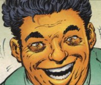
At least the art by Justiniano works to visually reinforce the off-kilter nature of the character: Titled panels, unusual angles, and a judicious use of shadows help convey the sense that things are unbalanced in the Creeper's world. I only wish he'd come up with some other facial expression for the Creeper: with that rictus grin and green hair, the Creeper looks like a yellowed version of the Joker.
The All-New Atom: What the heck is up with that one guy's eyes? Are we supposed to assume that he's insane? Because I'm pretty sure that "dark patches under the eyes" look is how Byrne has signified madness for characters like Maximus and the Joker.
The Trials Of Shazam! Why does everyone look like they've had too much to drink? I know colorists are really fond of all the fancy tricks they can do with today's technology, but the over-coloring of characters' faces often makes them look inebriated. "Jussh one more >hick< drink and I'll go back to being Billy Bashin!"
ETERNALS #1: You know, all I really remember about this a couple days later is how odd John Romita, Jr.'s people look. And it's not like his style suddenly changed for this book, but for some reason his "big heads and skinny necks" characters look really weird. Maybe it's the different inker. As for the story, feh. Again, nothing stuck with me so I won't be sticking with this.
Back in April I placed a pre-order for a bunch of manga with DCBS. Since I still had a couple bucks to go before I hit the dollar limit for the lowest shipping plateau, I broke down and ordered a couple superhero comics that were being offered at 75% off. Last week, a shipment from DCBS arrived ... with no manga and all the superhero comics I'd ordered. OH CRUEL FATE!!! Oh well, at least I can try to salvage some enjoyment by sharing my
WONDER WOMAN (volume 3?) #1: So does this mean Dr. Psycho is wearing leopard-print boxers? And interesting that Dodson depicts Giganta as the only female character without ginormous breasts. What could it mean???
Behold! The League of Villainous Leopard-Print Fashion!!
BRAVE NEW WORLD: Not bad for an 80-page anthology that only cost a buck, but it didn't do anything to convince me to buy any of the series being advertised. Let's run them down one-by-one:
Martian Manhunter: I've always had a soft spot for the character, especially since the early days of the Giffen-era League, but this just looks like heavy-handed gritification of a character I find more interesting when he's the well-adjusted counterpoint to all the other unbalanced personalities around him. The art looked fine, but the scene with J'onn arguing with a cardboard cutout of himself was painfully bad. I don't want to read the adventures of J'onn J'onnz, the Angstiest Alien Alive; I want stories of a grounded Martian Manhunter using his fantastic abilities to help his adoptive siblings.
OMAC: Some nice (if inconsistent) European-looking art can't really cover up this segment's utterly dull plot and incredibly clunky scene transitions. I suppose one could argue that the "it was all a dream" ending explains the awkward panel jumps, but that simply trades one problem for an even larger one: revealing that the events depicted didn't actually occur invalidates the entire story and negates any interest readers may have developed in the characters. We're basically left with two panels of "real" characterization, neither of which does anything to flesh out the main protagonist of the upcoming mini-series.
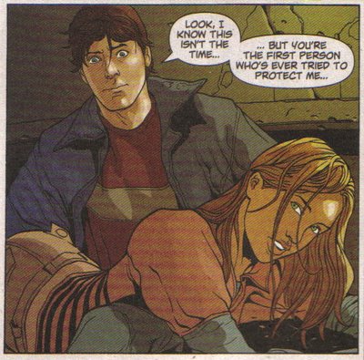
Really, this installment is such a mess it's almost impressive just how much wrongness Jones manages to cram in in only eleven pages. Here's a bit that at least provides a little unintentional humor: In this scene, Mike Costner is on the run from a pack of OMACs that nearly killed him and a woman claiming to be his girlfriend. But even though his life is in imminent danger, our hero can only think of one thing when the female character lands in his lap:
For males, Sexual Drive > Self-Preservation
"Look, I know this isn't the time... (Don't let her know you're staring at her ass! Don't let her know you're staring at her ass!!) ...but you're the first person who's ever tried to protect me..." What a putz.
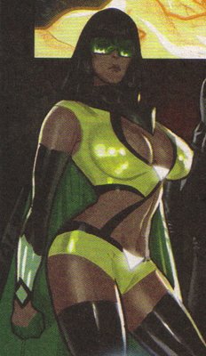
Uncle Sam and The Freedom Fighters: Whoa! Look at the size of Phantom Lady's ta-tas!! And talk about a great costume design! What a brilliant idea to update Phantom Lady's already suggestive costume with two little glowing arrowheads highlighting her naughty bits!! Hey, fanboys: Here's where to direct your male gaze!! Erik Larsen must be steaming that he didn't come up with this trend-setting design for any of his female characters!
I think I remember this character from an issue of Penthouse Comix.
The Creeper: I've always loved the concept of the Creeper, but there haven't been many stories that have done much to make the character genuinely, well, creepy. Andy Helfer and Keith Giffen's retelling of the Creeper's origin in Secret Origins #18 probably came closest in my book, but (as far as I can remember) this revamp was never followed up on. (I seem to remember hearing several times that Giffen had plans for The Creeper, but nothing ever materialized aside from a brief guest appearance in JLI.) I purchased the 90s Creeper series (by Len Kaminski and Shawn Martinbrough) but I honestly can't remember anything about it. (According to Wikipedia, that series tried to tweak the Creeper's origin yet again, suggesting that the involvement of Dr. Yatz was an implanted memory.)
As for the take in this book, it's a bit uneven but it has potential. I actually like the idea of Jack Ryder using his TV soapbox to publicly denounce his alter ego in an effort to throw the detective suspicious of Ryder's connection to the Creeper off track: it's like compressing the J. Jonah Jameson and Spider-Man / Peter Parker dynamic into one character. What doesn't work for me is Ryder's internal narration about how the Creeper persona is motivating him to be a better person. What exactly about the concept of the Creeper inspires altruism?
At least the art by Justiniano works to visually reinforce the off-kilter nature of the character: Titled panels, unusual angles, and a judicious use of shadows help convey the sense that things are unbalanced in the Creeper's world. I only wish he'd come up with some other facial expression for the Creeper: with that rictus grin and green hair, the Creeper looks like a yellowed version of the Joker.
The All-New Atom: What the heck is up with that one guy's eyes? Are we supposed to assume that he's insane? Because I'm pretty sure that "dark patches under the eyes" look is how Byrne has signified madness for characters like Maximus and the Joker.
"Stare into the very face of EVIL!!"
The Trials Of Shazam! Why does everyone look like they've had too much to drink? I know colorists are really fond of all the fancy tricks they can do with today's technology, but the over-coloring of characters' faces often makes them look inebriated. "Jussh one more >hick< drink and I'll go back to being Billy Bashin!"
ETERNALS #1: You know, all I really remember about this a couple days later is how odd John Romita, Jr.'s people look. And it's not like his style suddenly changed for this book, but for some reason his "big heads and skinny necks" characters look really weird. Maybe it's the different inker. As for the story, feh. Again, nothing stuck with me so I won't be sticking with this.
